CTkSegmentedButton
Example Code
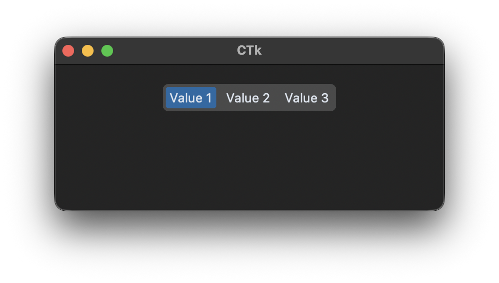
Without variable:
def segmented_button_callback(value):
    print("segmented button clicked:", value)

segemented_button = customtkinter.CTkSegmentedButton(app, values=["Value 1", "Value 2", "Value 3"],
                                                     command=segmented_button_callback)
segemented_button.set("Value 1")
With variable:
def segmented_button_callback(value):
    print("segmented button clicked:", value)

segemented_button_var = customtkinter.StringVar(value="Value 1")
segemented_button = customtkinter.CTkSegmentedButton(app, values=["Value 1", "Value 2", "Value 3"],
                                                     command=segmented_button_callback,
                                                     variable=segemented_button_var)
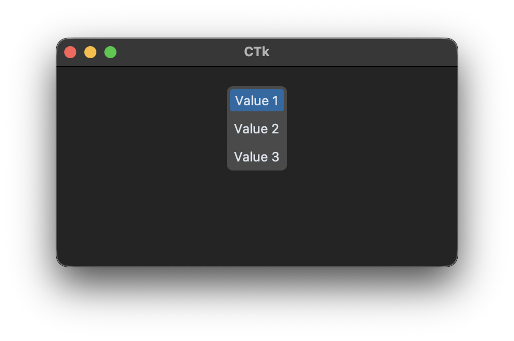
Vertical orientation (new in 6.0):
segmented_button = customtkinter.CTkSegmentedButton(app, values=["Value 1", "Value 2", "Value 3"],
                                                     orientation="vertical")
Arguments
| argument | value |
|---|---|
| master | root, frame, top-level |
| width | box width in px |
| height | box height in px |
| corner_radius | corner radius in px |
| border_width | space in px between buttons and the edges of the widget |
| bg_color | color behind the widget, only visible at the rounded corners, "transparent" (default) takes the color of the parent widget, tuple: (light_color, dark_color) or single color |
| fg_color | color around the buttons, tuple: (light_color, dark_color) or single color |
| selected_color | color of the selected button, tuple: (light_color, dark_color) or single color |
| selected_hover_color | hover color of selected button, tuple: (light_color, dark_color) or single color |
| unselected_color | color of the unselected buttons, tuple: (light_color, dark_color) or single color or "transparent" |
| unselected_hover_color | hover color of unselected buttons, tuple: (light_color, dark_color) or single color |
| text_color | text color, tuple: (light_color, dark_color) or single color |
| text_color_disabled | text color when disabled, tuple: (light_color, dark_color) or single color |
| background_corner_colors | tuple of four colors for the background behind the corners (top left, top right, bottom right, bottom left), default is None |
| font | button text font, tuple: (font_name, size) |
| values | list of string values for the buttons, can't be empty |
| variable | StringVar to control the current selected value |
| state | "normal" (standard) or "disabled" (not clickable, darker color) |
| command | function will be called when the dropdown is clicked manually |
| dynamic_resizing | enable/disable automatic resizing when text is too big to fit: True (standard), False |
| orientation | "horizontal" (standard) or "vertical", stacks the buttons from top to bottom (new in 6.0) |
Arguments and methods that all widgets share, like bg_color, .bind(), .focus() or .destroy(), are described on Common arguments and methods.
Methods
-
.configure(attribute=value, ...)
All attributes can be configured and updated, for example:
segemented_button.configure(state="disabled") -
.cget(attribute_name)
Pass attribute name as string and get current value of attribute.
-
.set(value)
Set to specific value. If value is not in values list, no button will be selected.
-
.get()
Get current string value.
-
.index(value=None)
Returns the position of the selected value. If a value is passed, returns the position of that value instead. Raises
ValueErrorif the value does not exist. (new in 6.0) -
.len()
Returns the number of buttons. (new in 6.0)
-
.insert(index, value)
Insert new value at given index into segmented button. Value will be also inserted into the values list.
-
.move(new_index, value)
Move existing value to new index position.
-
.delete(value)
Remove value from segmented button and values list. If value is currently selected, no button will be selected afterwards.